Company Workflow App
Overview
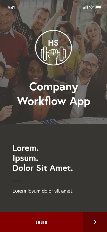
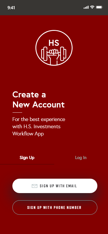
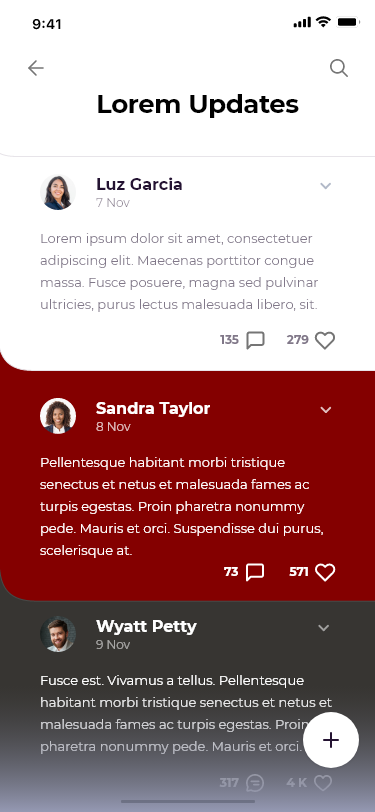
This app was designed for a client looking to streamline company processes and allow employees access to various aspects of the job while they are away from the office. The app serves as a streamlining tool for the company and a digital work assistant for staff in the field. The app simplifies work processes for staff by making multiple work processes conveniently accessible via smart device.
Responsibilities: Mobile App Design, UI/UX Design
Target Audience: Employees of the Company
Tools Used: Adobe XD
Budget: High
Year: 2021
The Problem
The client initially requested an eLearning course to increase communication between staff working in the field and office staff to help staff in the field get tasks completed, requests fulfilled, clarity on various procedures, and more. Nearly 60% of this company’s staff works out in the field, away from offices where typical resources are located. I thought about this and determined that an eLearning course on communication wouldn’t cut it.
I figured that may cause more problems by inundating office staff with more duties. After all, there is a lesser amount of in-office employees. For this, I suggested a comprehensive app that could foster convenience and reduce time spent on routine tasks. The implementation of this app was necessary to ensure all employees receive the same amount of access to company resources. It also assisted in balancing the allocation of duties.
The Solution
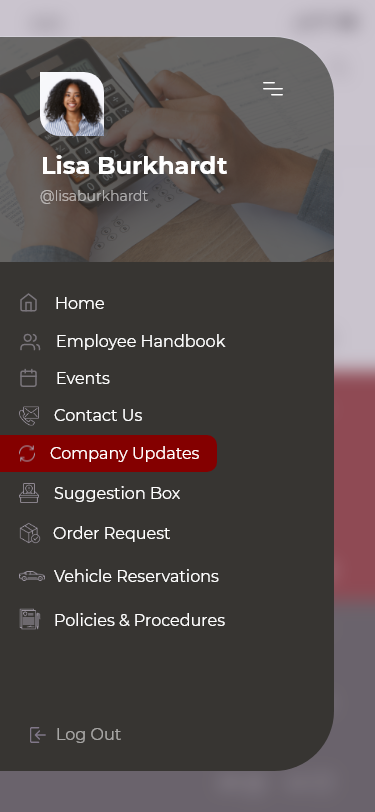
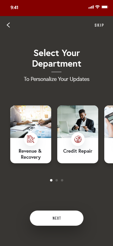
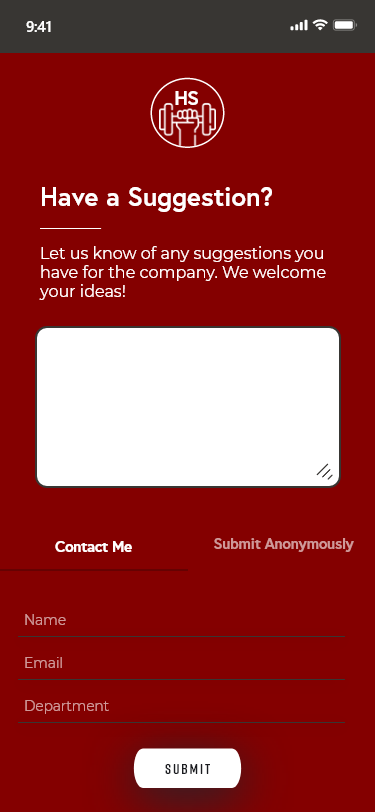
To provide a useful app, I followed a structured process that allowed me to design and release the app to address the client’s specified concerns. I suggested the incorporation of general company updates, updates by department, company vehicle reservations, their employee handbook, policies, procedures, conference room reservations, an anonymous digital suggestions box, etc. I emphasized that these elements would be beneficial for employees to have handy at all times. The client agreed with my suggestions and determined that an app was the appropriate tool for solving company issues. I got started on this project immediately!
Process
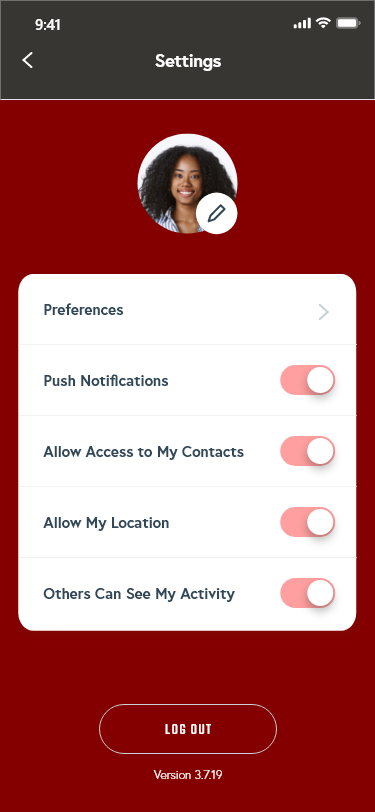
I started by working with the client to determine exactly what her goals and expectations were for her organization and employees, then I did a bit of research on my own regarding this particular company and how they’ve operated and branded themselves. From there, I mimicked their branding, yet modernized their existing style to create a relevant color palette and visually appealing design system. I designed visual mockups, a wireframe and rapidly prototyped the application in Adobe XD. From there, I was able to meticulously test the usability of the prototype and make any revisions in preparation for full development.
The Design System
During the first step in my process, I determined the foundational elements of the application. For instance, to begin I created the design scheme including typography, branding (logos), colors, etc. I also determined the aesthetic and function of elements like navigation, symbols, H1-H6 headings, buttons, hyperlinks, calls-to-action, and form submissions.
During this process, I also uploaded to my assets panel, any resources I created or obtained licensing for that helped in my design decisions going forward. Uploading font families, color palettes, images, illustrations, and other media helped me to streamline my design and development processes. Identifying and placing all my assets in one place saved me ample time and energy.
The App Map
To map out this app, I identified all the necessary pages and categorized the relationships between them. This helped me determine how many artboards I would need to provide accurate and quality navigation throughout the application.
The Hi-Fi Wireframe
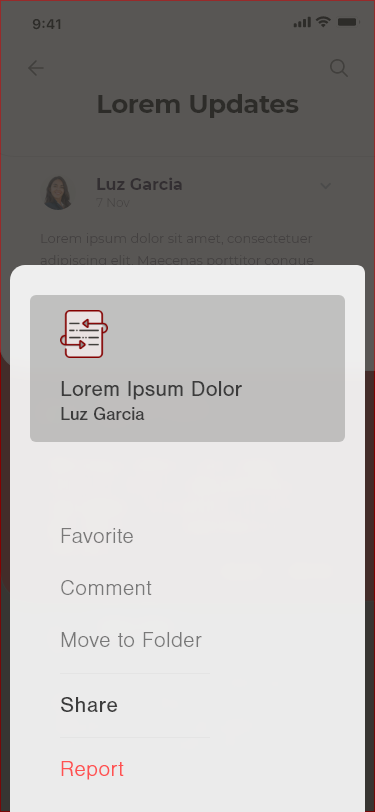
Wireframing helped me set up content and define the application’s developing user experience. I started by creating a high-fidelity wireframe (a nearly complete representation of the end product) that set the foundation for what would later become the finished product. I kept the client’s concerns in mind for mockups so the relationship between the prototype and the finished product would be as aligned as possible.
The Prototype
In this final stage, I rapid-prototyped the application to link pages, add states and transitions, and enhance the design before I exported my assets. Prototyping helped me ensure that the relationship between prototype and application was in alignment, as I mentioned earlier. Prototyping also helped me introduce a rough draft of the application to the client prior to full development.
Full Stack Development
After designing the app in XD and making necessary revisions after usability tests, I was able to hand over the design specs and assets to a developer who practices using middleware and back-end tools for further development, testing, deployment, and support.
Results
The client was pleased with the suggestions I provided along with the overall design of the application! After following up with the client post-development and implementation, it appears this app was well-received amongst staff. The client expressed that the application is being used so often that she can’t remember how the staff was getting along without it!


